Mastering Color Harmony: 3 Colors That Always Look Stunning Together
Have you ever stared at paint swatches, completely overwhelmed by which colors actually work together? I’ve been there, and I’m going to break down exactly how to choose three colors that look like they were meant to be together.
Triadic Color Combinations: Bold Brilliance Unleashed
Imagine a color wheel where three shades are perfectly balanced like gymnasts on an emotional tightrope. That’s the triadic approach.
Classic Triadic Palettes That Never Fail:
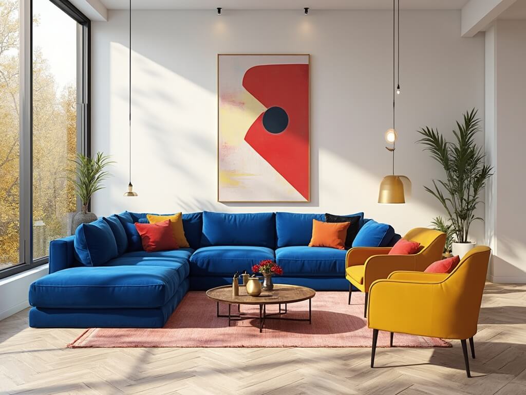
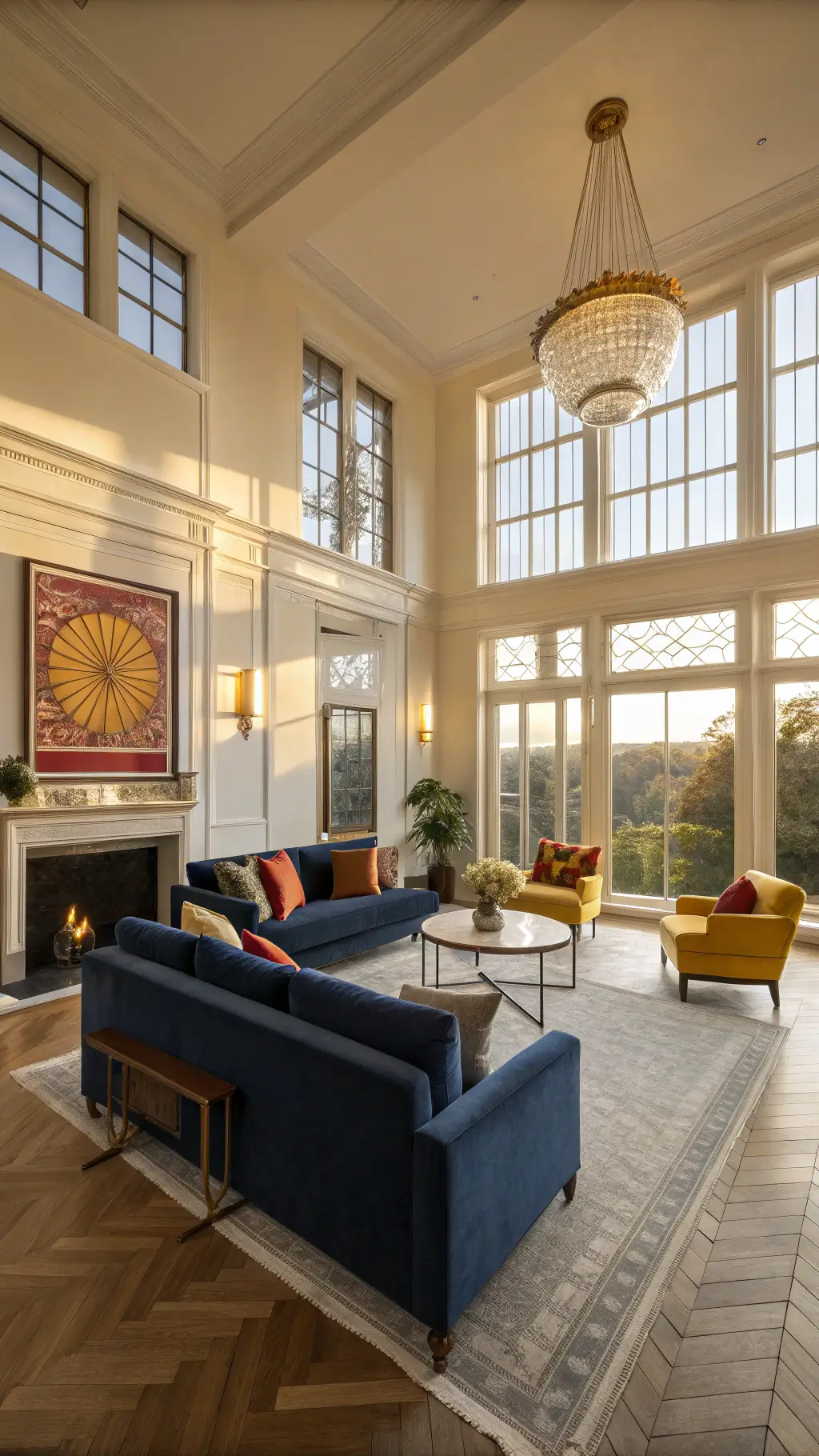
- Red + Yellow + Blue (the ultimate primary color trio)
- Orange + Green + Purple (unexpected but breathtaking)
These combinations create visual electricity. They’re not whispers – they’re full-volume statements.
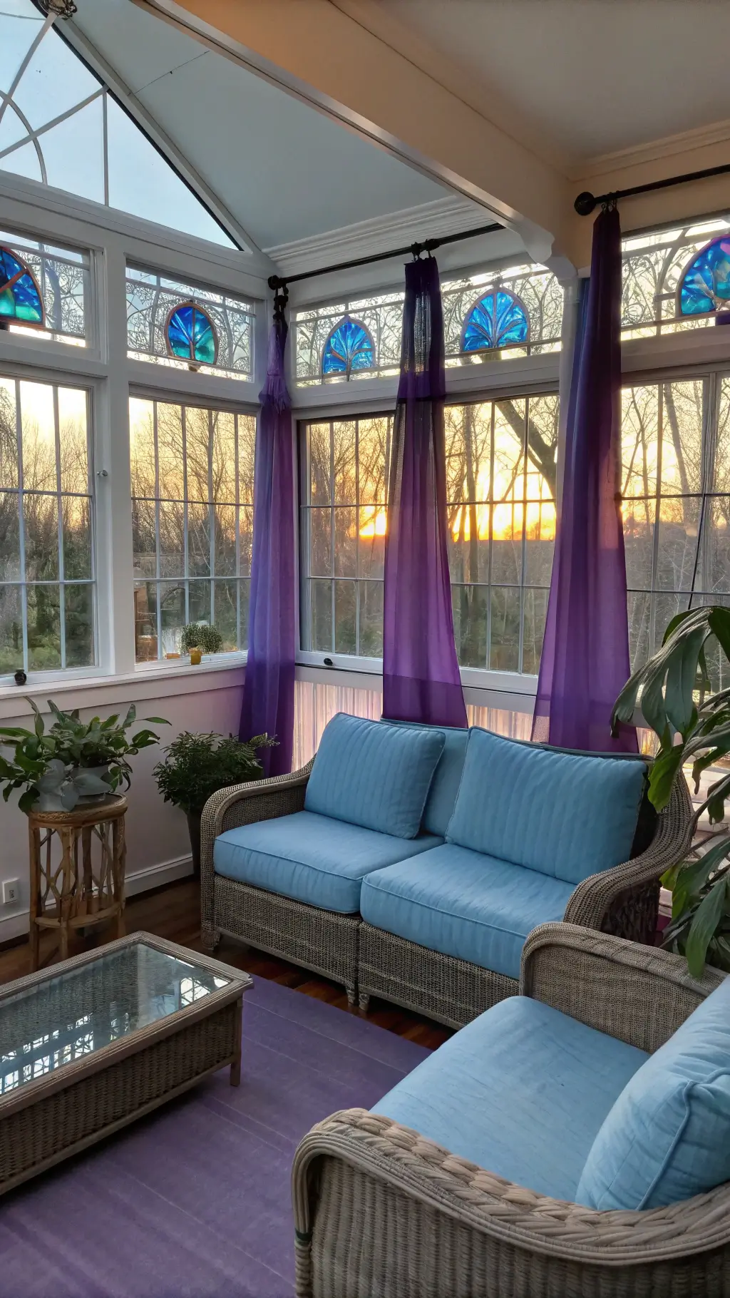
Analogous Colors: The Smooth Operators
Think of analogous colors like best friends who finish each other’s sentences. They’re right next to each other on the color wheel, creating pure harmony.
Smooth Combinations to Try:
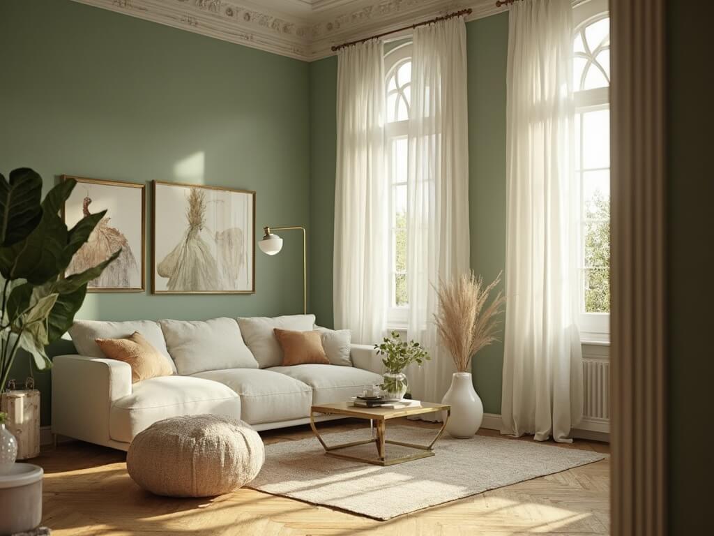
- Yellow → Yellow-Green → Green (nature’s favorite gradient)
- Blue → Blue-Violet → Violet (moody and sophisticated)
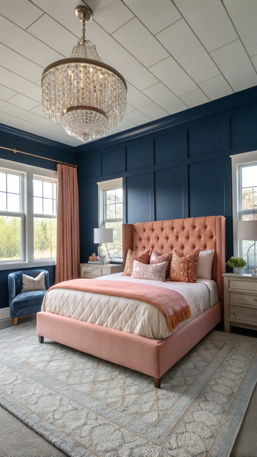
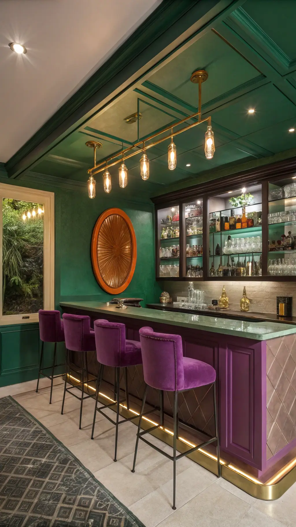
Split Complementary: The Design World’s Secret Weapon
This technique is for those who want drama without chaos. You pick one base color, then grab the two colors adjacent to its direct opposite.
Killer Example:
Blue + Yellow-Orange + Red-Orange = instant visual intrigue
2025 Color Trends: What the Cool Kids Are Choosing
Refined Elegance
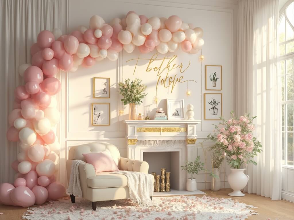
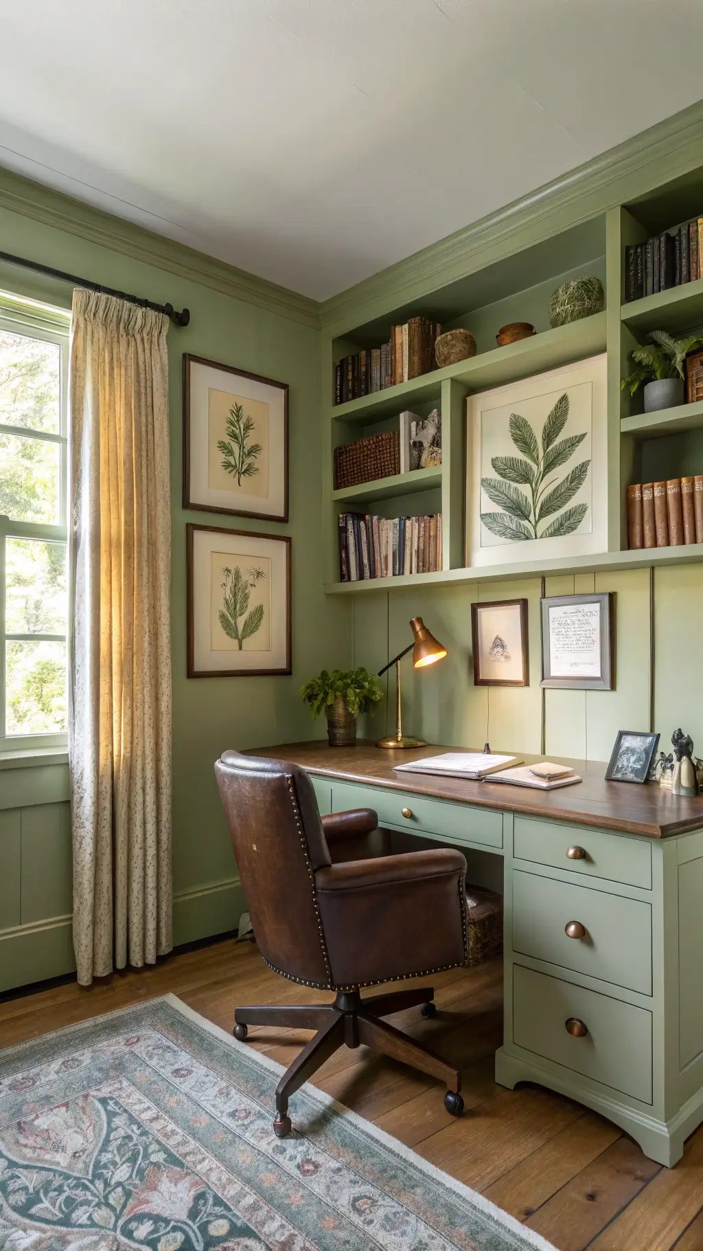
- Mauve
- Dusty Rose
- Soft Blue-Gray
Vibe: Sophisticated, modern, whispers of femininity
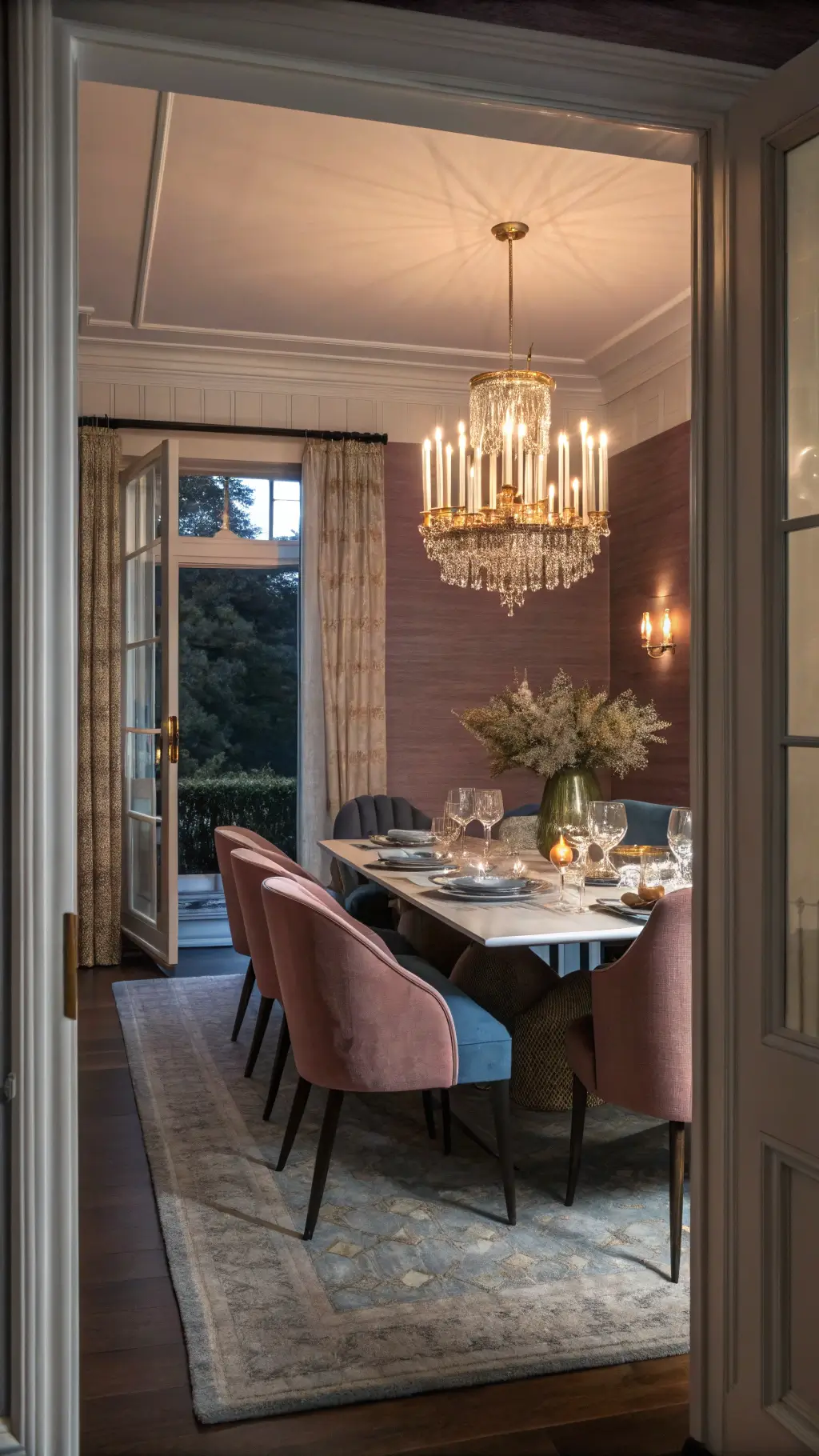
High-Energy Fun
- Bright Green
- Pink
- Red-Orange
Vibe: Retro, playful, absolute personality

Pro Tips for Color Selection
Choose Your Mood:
- Want contrast? Go triadic or split complementary
- Seeking harmony? Stick with analogous palettes
Quick Decision Matrix:
- Energy needed → Bolder combinations
- Calm required → Softer, closer color relationships
Remember: Colors are emotional. They’re not just visual – they’re psychological experiences.
Bonus Insider Tip:
Always test your colors in the actual space. Paint swatches are liars. Natural and artificial light can completely transform how colors interact.
Pro Designer Secret: Buy sample pints and create large test patches. Live with them for a few days. Colors have personalities – make sure you actually like hanging out with them.
Happy color hunting! The perfect trio is waiting to transform your space from “meh” to magnificent.