Why Color Matters in a Farmhouse Kitchen
Choosing the right color scheme isn’t just about looking pretty. It’s about creating a soul-warming space that feels like home.
The Perfect Neutral Foundation
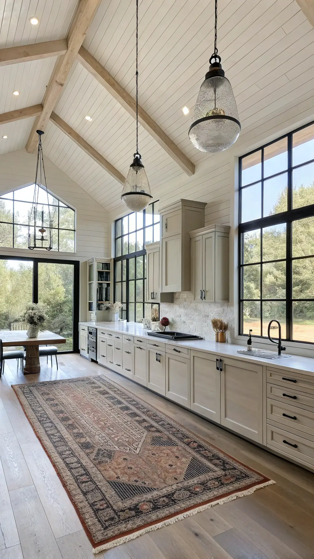
Whites and Creams: Your Design Superheroes
- Soft whites create an airy, spacious feel
- Creamy beiges add warmth without feeling overwhelming
- Pro tip: Sherwin-Williams “Alabaster” is my absolute go-to neutral
Color Palettes That Sing Farmhouse Charm
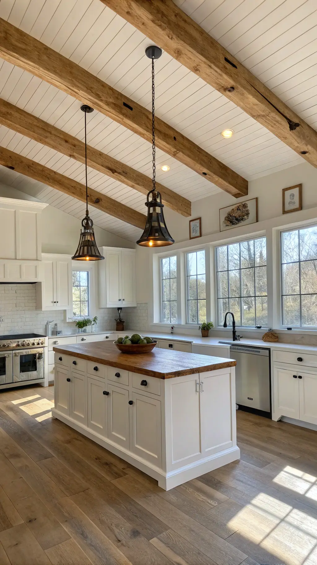
1. Classic Neutrals with a Twist
- Base of crisp white walls
- Warm wood accents
- Subtle gray undertones for depth
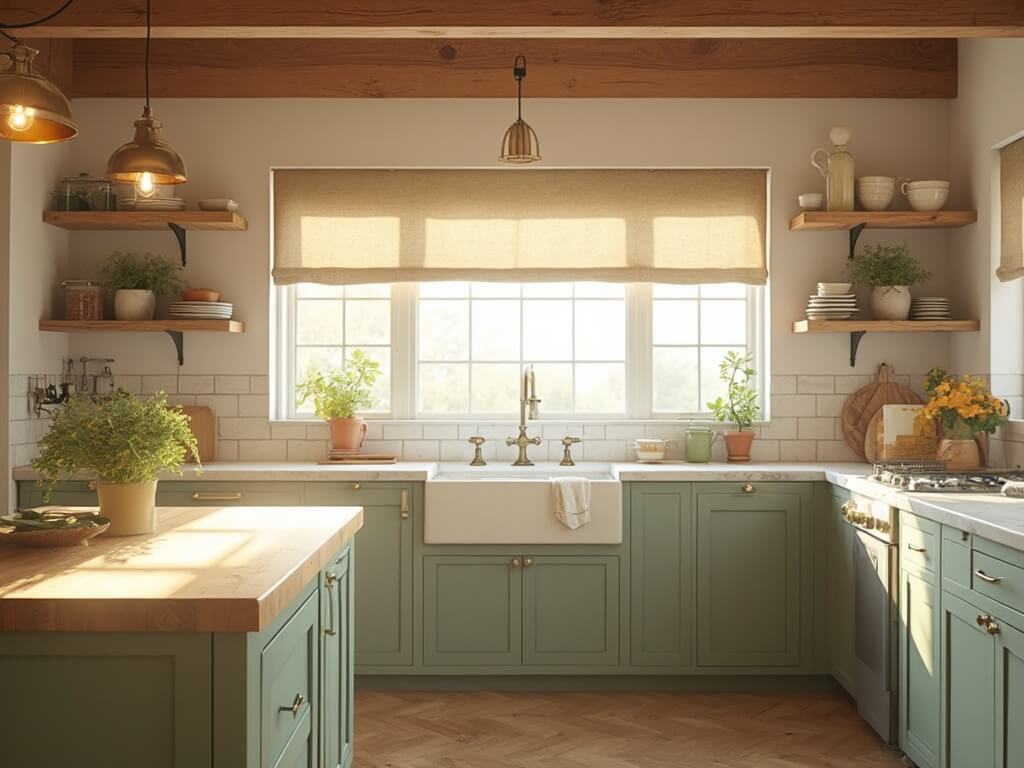
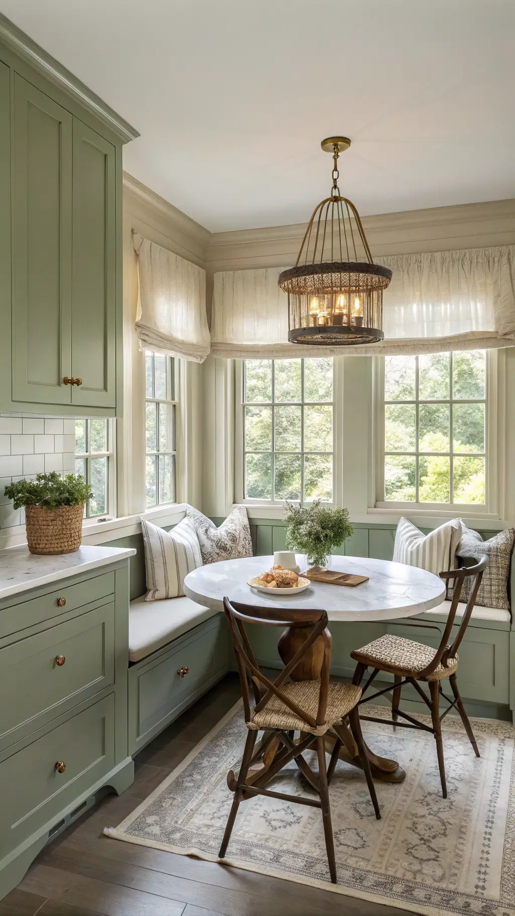
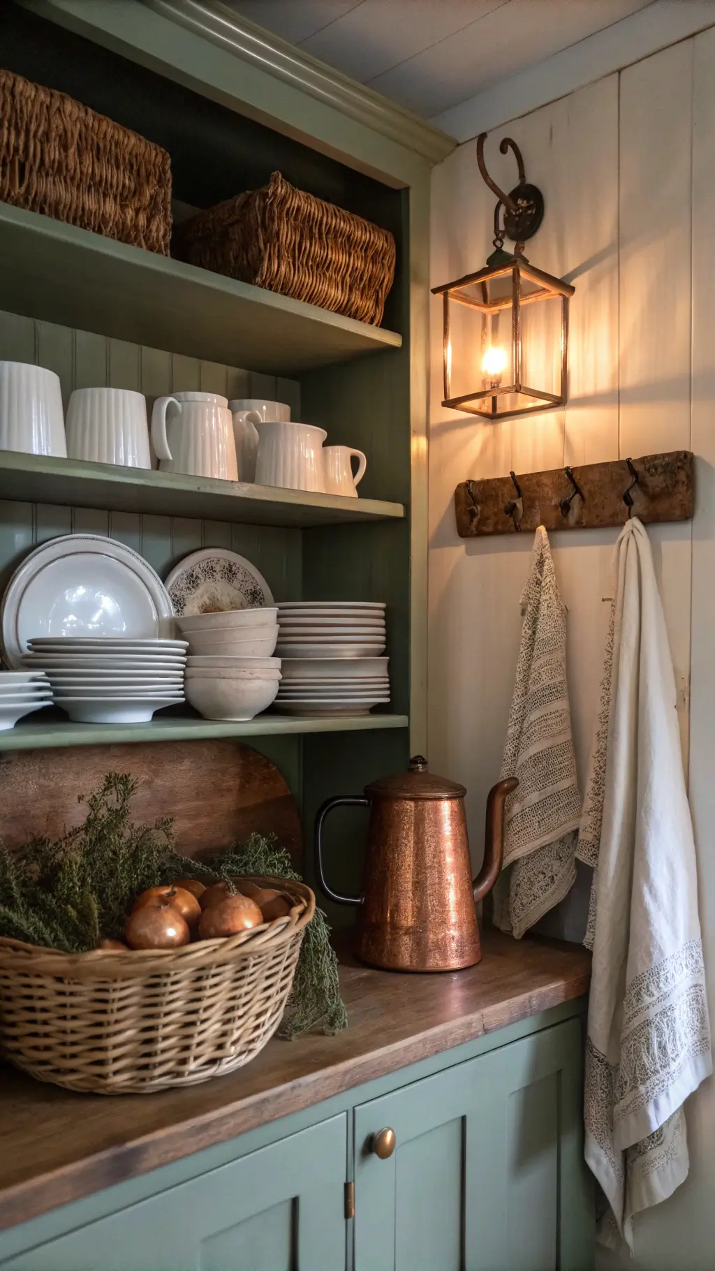
2. Nature-Inspired Palette
- Sage green cabinetry
- Wooden countertops
- Cream-colored walls
- Brass hardware for a touch of warmth
Bold Color Choices That Work Magic
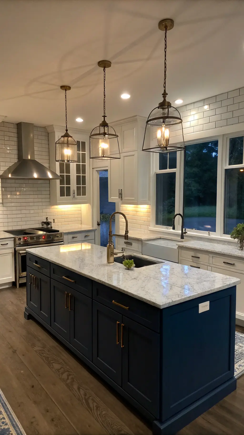
Blues: From Whisper to Statement
- Powder blue for a soft, calming vibe
- Navy for dramatic sophistication
- Perfect for islands or lower cabinets
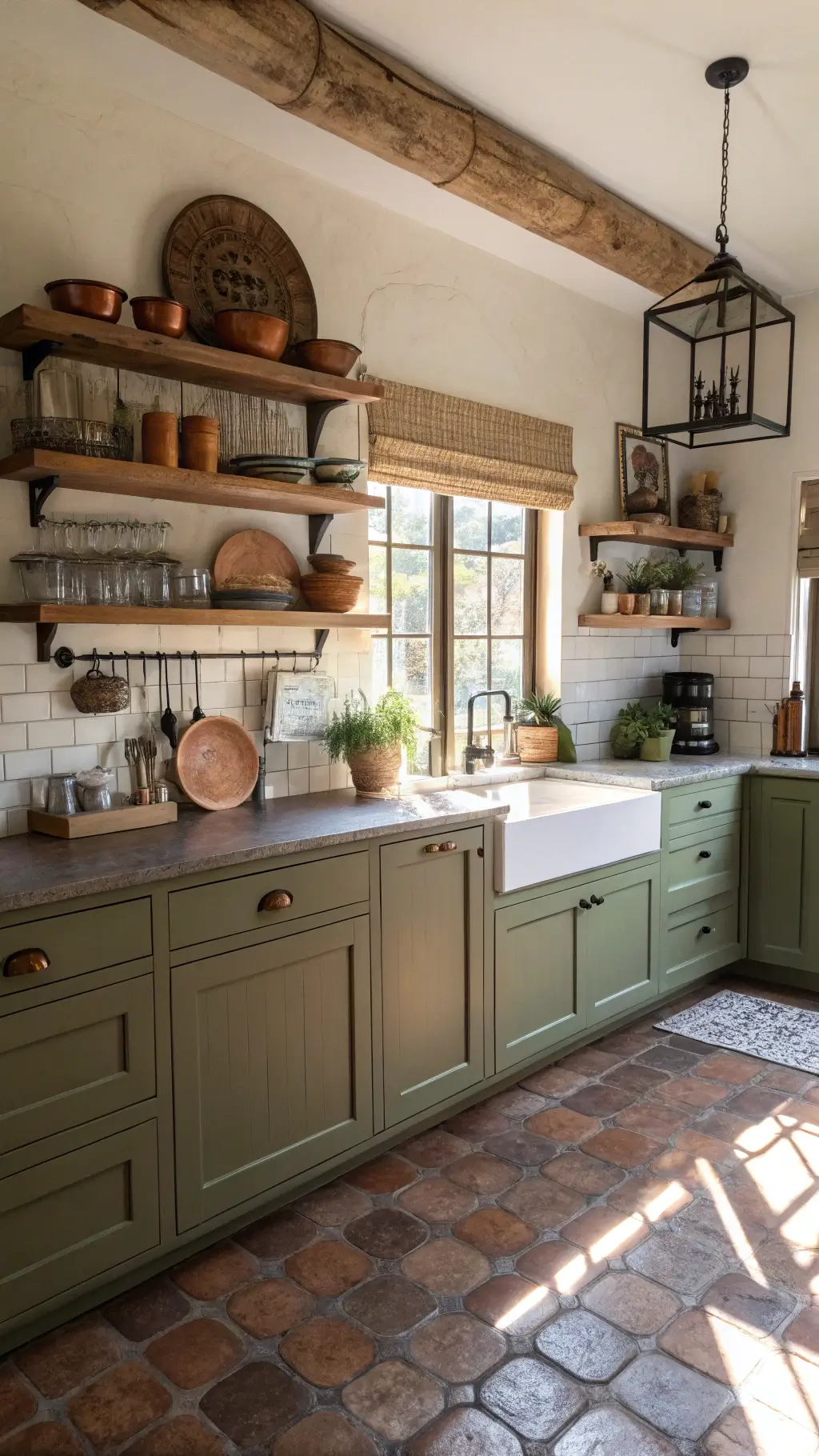
Greens: Bringing the Outdoors Inside
- Olive green: Earthy and sophisticated
- Sage: Totally on-trend right now
- Works brilliantly with natural wood elements
Accent Colors That Pop
Unexpected Color Heroes:
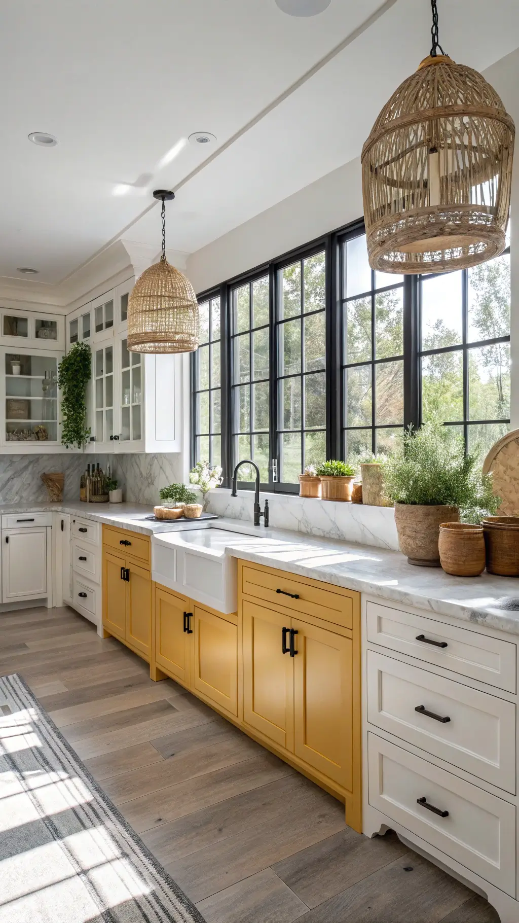
- Mustard yellow
- Terra-cotta
- Soft blush
- Black (for crisp definition)
Pro Styling Tips
Texture is Your Secret Weapon
- Layer different materials
- Mix matte and glossy finishes
- Use natural textiles like linen and cotton
Hardware and Lighting Matter
- Black fixtures add modern edge
- Brass or gold for vintage warmth
- Matte finishes keep things authentic
Practical Paint Recommendations
Top Paint Picks:
- White: Benjamin Moore “Simply White”
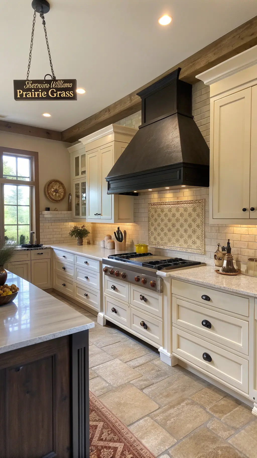
- Gray: Sherwin-Williams “Prairie Grass”
- Blue: Benjamin Moore “Hale Navy”
- Green: Benjamin Moore “Dry Sage”
Final Thoughts
Remember, a farmhouse kitchen is about feeling—not just looking perfect. Choose colors that make you feel at home, that tell your story.
Key Takeaway: Start neutral, layer with personality, and let your space breathe.