What Makes Pale Oak So Special?
Pale Oak (OC-20) isn’t just another neutral. It’s a game-changing greige that transforms kitchens from ordinary to extraordinary.
Key Color Characteristics:
- Warm greige with subtle taupe undertones
- Adapts brilliantly to different lighting conditions
- Light enough to brighten spaces
- Neutral enough to match virtually any design style

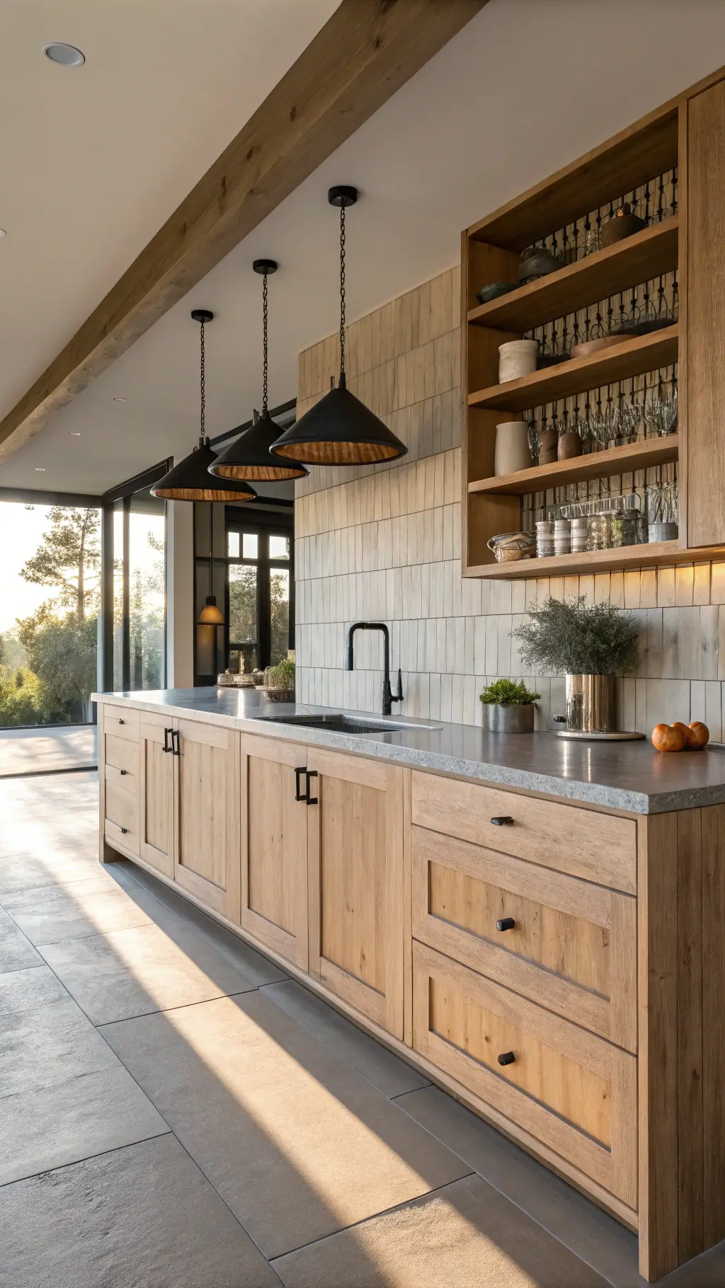
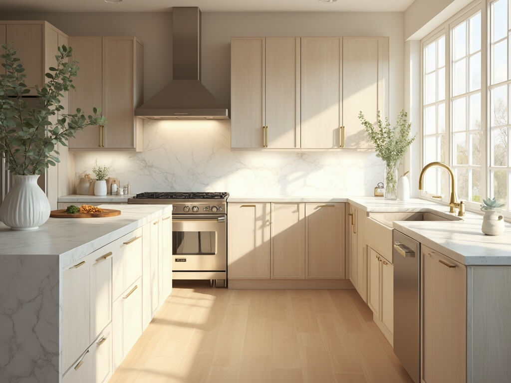
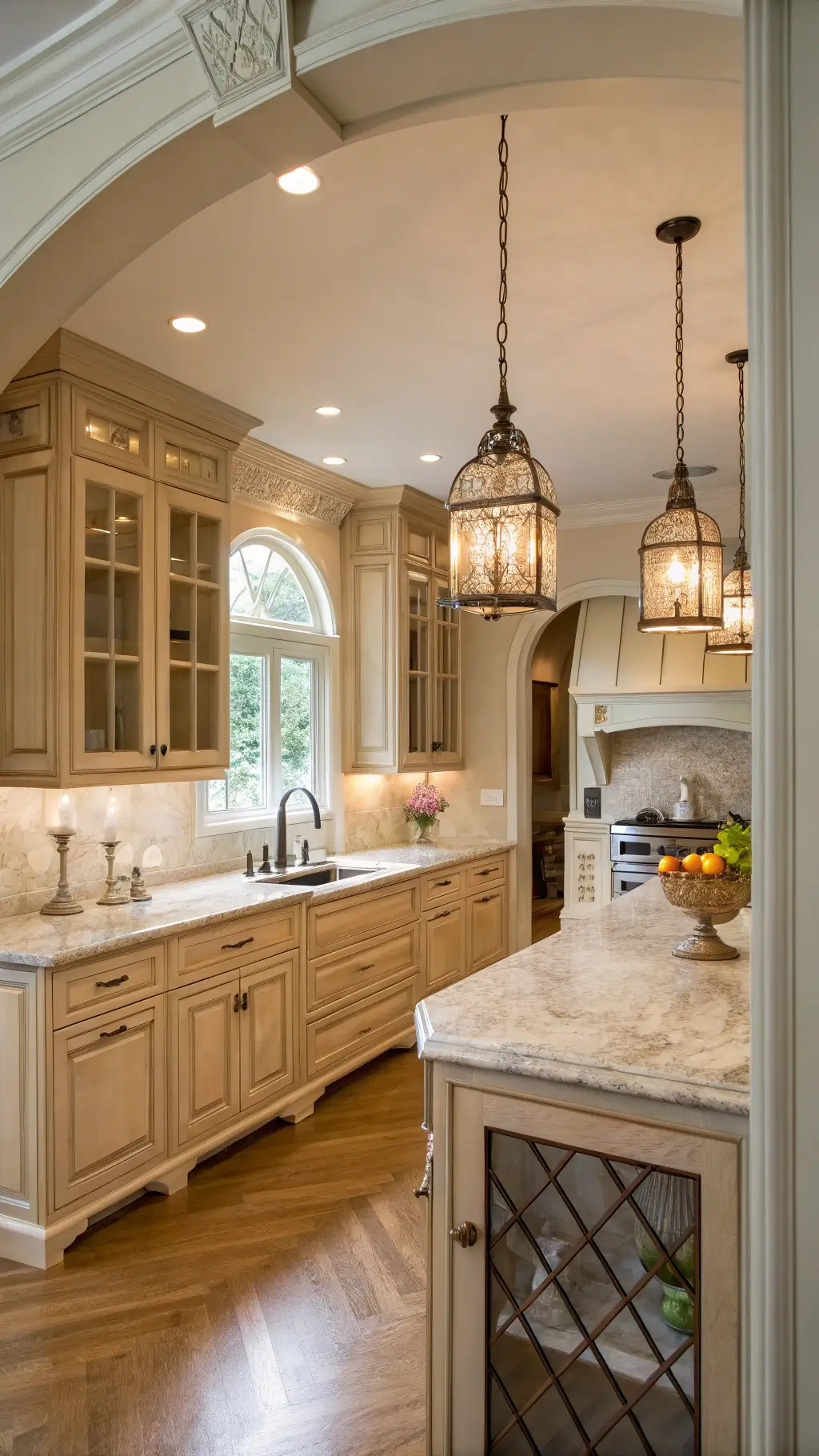
🖼 Steal This Look
- Paint Color: Sherwin-Williams Accessible Beige SW 7036 – the perfect warm greige that mirrors Pale Oak’s transformative qualities with subtle taupe undertones that adapt beautifully to kitchen lighting
- Furniture: sleek white shaker-style upper cabinets paired with a large kitchen island in matching pale oak finish, complemented by warm brass cabinet hardware and natural wood bar stools
- Lighting: warm LED under-cabinet strip lighting combined with pendant lights in brushed brass finish to enhance the greige undertones
- Materials: natural quartzite countertops in warm cream tones, subway tile backsplash in soft white, and brushed brass fixtures throughout
There’s something magical about pale oak that makes every kitchen feel both timeless and current – it’s that perfect sweet spot between gray and beige that somehow makes everything else in the room look more expensive.
Designer-Approved Pairings That Wow
My go-to combinations for Pale Oak kitchen cabinets include:
Perfect Color Companions
- Countertops: Soft, warm whites
- Wall Color: Benjamin Moore White Dove
- Hardware: Brass or aged brass finishes
- Backsplash: Glossy white tiles or subtle texture
Killer Design Combo
- Cabinets: Benjamin Moore Pale Oak
- Countertop: Taj Mahal Quartzite
- Backsplash: White Damask Tile
- Walls: White Dove
- Hardware: Aged brass knobs
💡 Steal This Look
- Paint Color: Benjamin Moore White Dove OC-17 for walls to create the perfect backdrop for Pale Oak cabinets
- Furniture: natural wood bar stools with brass accents and white quartz waterfall island
- Lighting: brass pendant lights with warm Edison bulbs over the kitchen island
- Materials: Taj Mahal quartzite countertops, white damask ceramic backsplash tiles, aged brass cabinet hardware
This designer-approved palette creates that coveted kitchen that feels both timeless and current. The interplay between Pale Oak’s gentle warmth and crisp White Dove walls gives you the perfect foundation for a kitchen that photographs beautifully and lives even better.
Why Designers Are Obsessed Right Now
The kitchen design world is experiencing a warm neutral revolution. Pale Oak sits perfectly at the intersection of:
- Trending warm aesthetics
- Timeless design
- Versatile color application
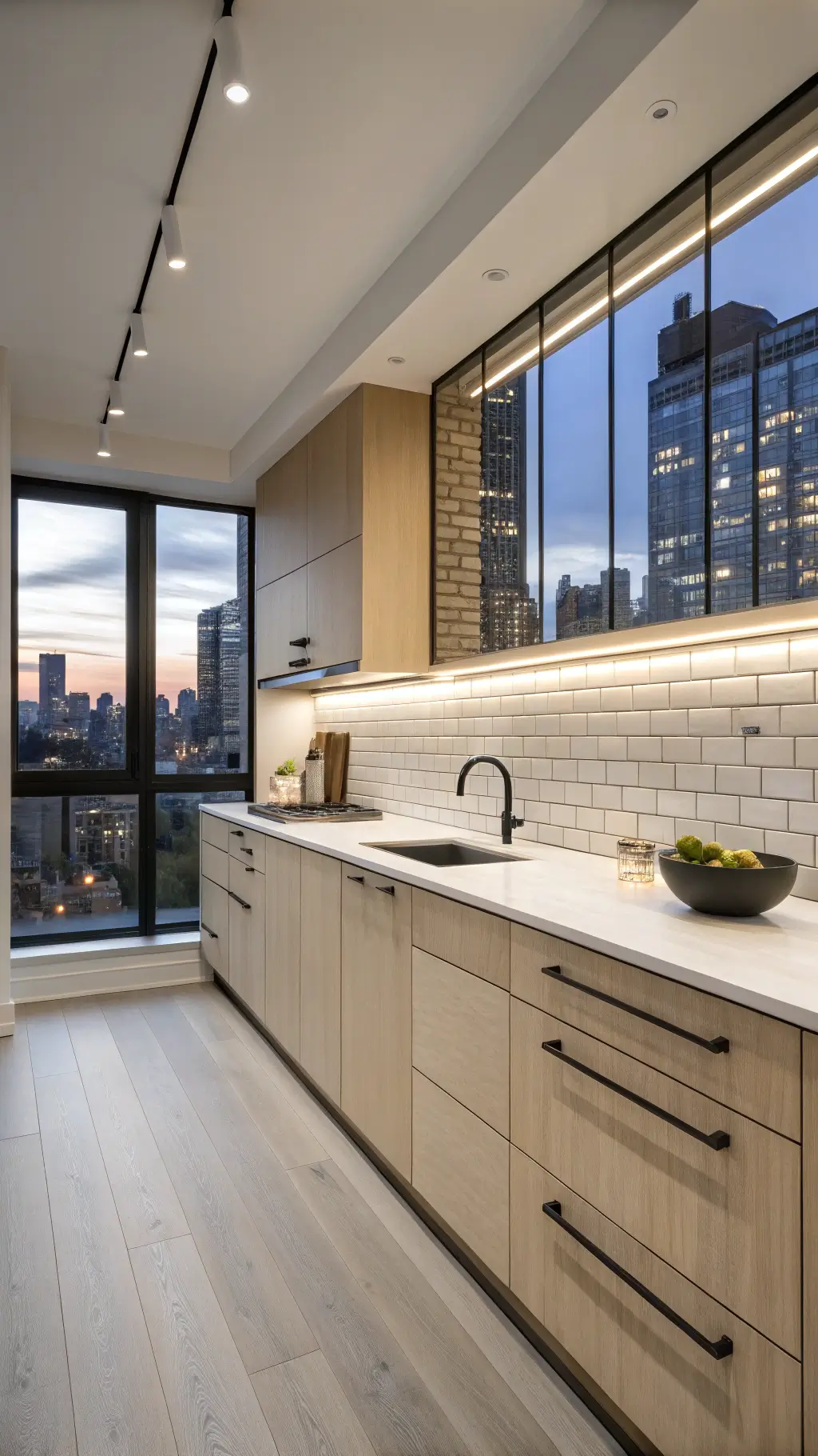 subway tile backsplash reflecting city shot tilt-shift lens at>
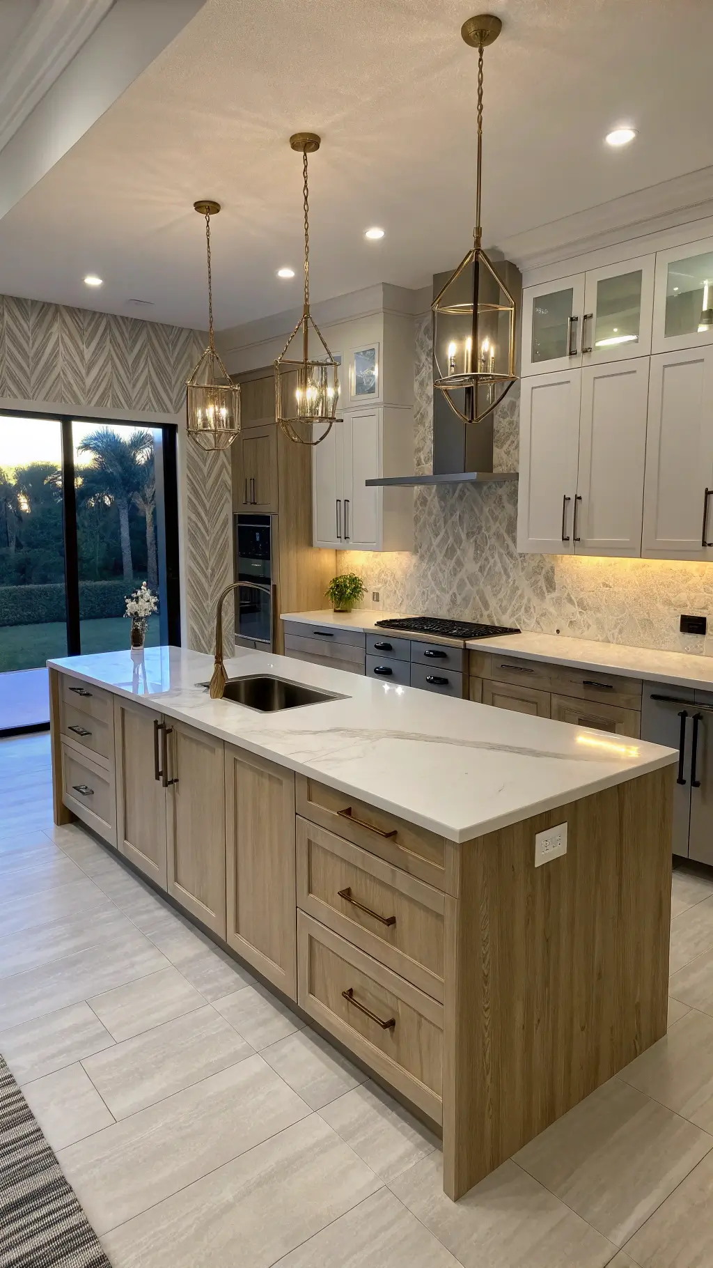
🎨 Steal This Look
- Paint Color: Farrow & Ball Joa’s White No. 226
- Furniture: warm oak kitchen island with waterfall edge and brass hardware
- Lighting: brass pendant lights with warm Edison bulbs over island
- Materials: pale oak wood grain, white subway tile, warm brass accents
There’s something deeply satisfying about pale oak’s ability to feel both contemporary and timeless in a kitchen. This warm neutral trend speaks to our desire for spaces that feel collected over time rather than designed all at once.
Pro Tips for Using Pale Oak
Lighting Matters:
- North-facing kitchens: Looks slightly cooler
- South-facing kitchens: Appears warmer and cozier
- Test large swatches before committing
Style Flex Points:
- Modern minimalist kitchens
- Farmhouse-inspired spaces
- Contemporary urban designs
- Traditional cooking spaces
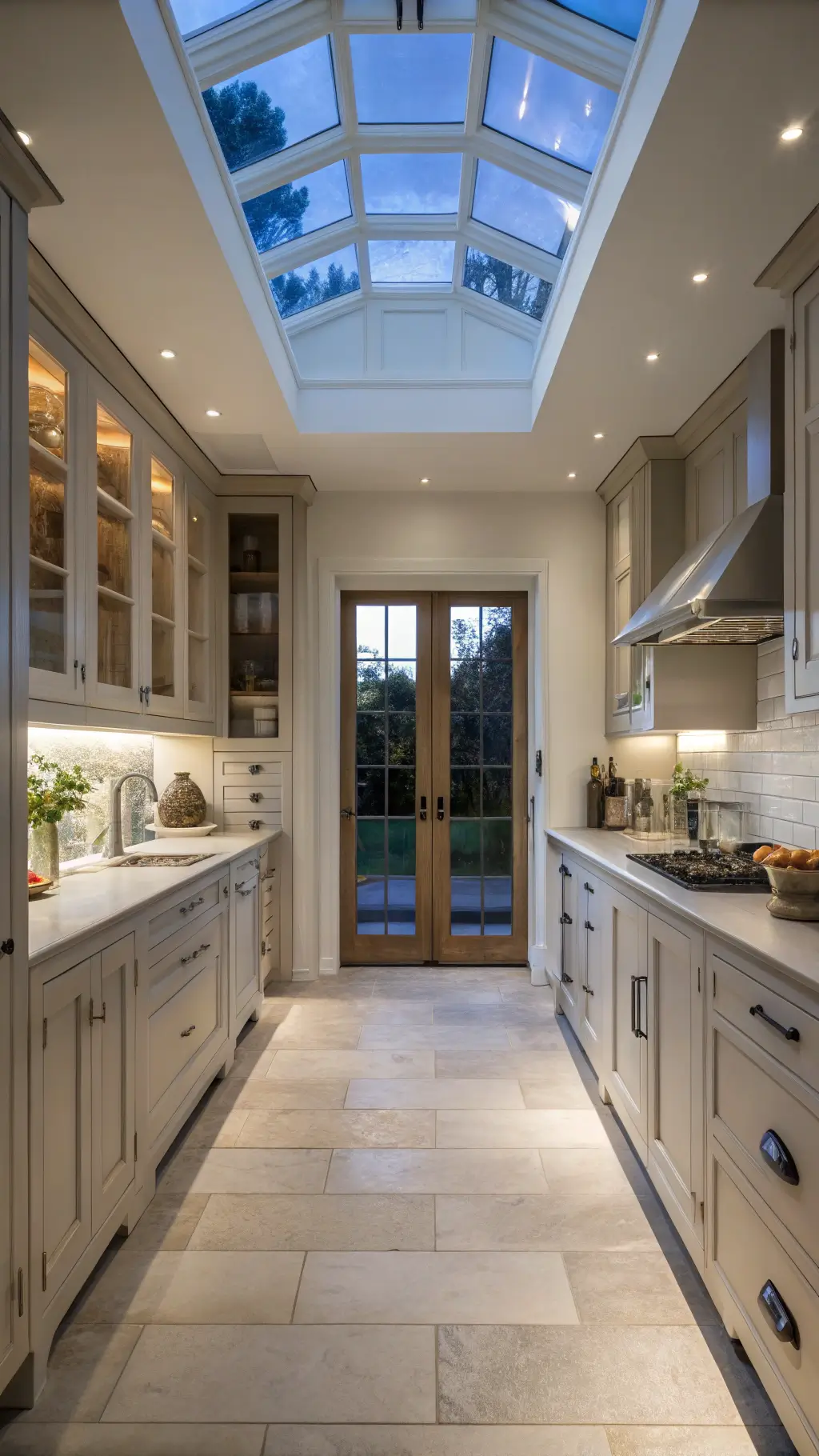
 pendant lights view of the ‘s pantry through an shot from corner wide-angle>
✎ Steal This Look
- Paint Color: Behr Pale Oak S210-2
- Furniture: warm wood kitchen island with butcher block countertop and brass hardware
- Lighting: brass pendant lights with warm LED bulbs
- Materials: natural wood grains, warm brass accents, and soft neutral stone countertops
Pale Oak strikes that perfect balance between too-cool gray and too-warm beige, making it the chameleon cabinet color that works beautifully whether you’re going full farmhouse or sleek contemporary.
What Homeowners Are Saying
Designers and homeowners agree: Pale Oak isn’t just a color. It’s a strategic design choice that offers maximum flexibility with minimum risk.
Quick Pros:
- Never looks dated
- Works with multiple design styles
- Creates a welcoming kitchen atmosphere
- Increases home resale value
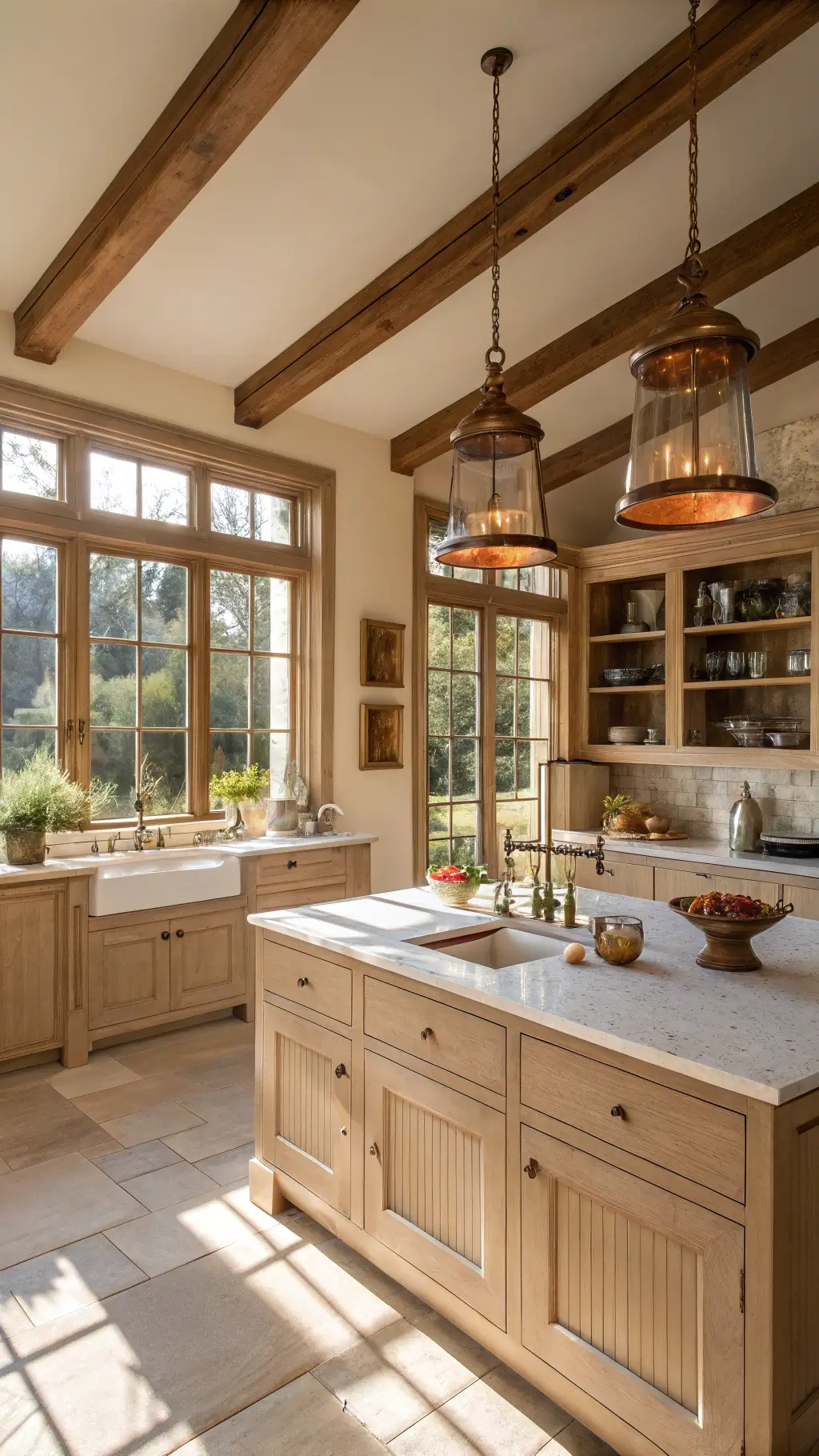
🌟 Steal This Look
- Paint Color: Valspar Pale Oak 7004-26 for cabinets with Valspar Swiss Coffee 7006-31 for walls to create the timeless neutral foundation homeowners rave about
- Furniture: natural wood bar stools with clean lines and a kitchen island with butcher block or quartz countertop in warm white
- Lighting: warm brass pendant lights or brushed gold fixtures to enhance the oak undertones
- Materials: natural wood grains, soft whites, and warm metal finishes that complement pale oak’s versatility
There’s something deeply satisfying about choosing a cabinet color that both you and future buyers will love. Pale oak gives you that rare combination of personal style and smart investment.
Final Thoughts
Pale Oak isn’t just a paint color. It’s your kitchen’s secret weapon for creating a space that feels both contemporary and timeless.
Pro tip: Always get large paint swatches and test in your specific kitchen lighting before making a final decision.